
Whether you’re visiting a website or a listening to a presentation, you’ve probably thought about data visualization as a helpful way to digest complex information. At its best, “data viz” communicates data simply and efficiently using a combination of graphs, graphics, and other forms of design.
What makes a good graph great? Let’s answer that question by taking a walk down memory lane.
Earlier in my career, I was a researcher for a large nonprofit in Washington, DC. We gathered for all-staff meetings every few months, all 100 of us standing like sardines inside our largest conference room. In those meetings, we needed to know more about the teenagers and families we were working with in the community and whether our afterschool programs were effective.
When it was my turn to report on the data, I would stand in front of my fellow sardines and show a slide like this on our tiny, grainy projector screen.
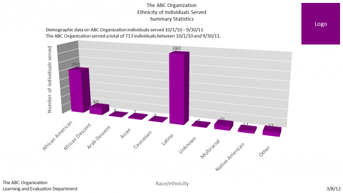
Staff squinted, straining their eyes to read small, diagonal text. I mumbled through a few talking points, like how we worked with a lot of Latino teenagers. They clapped, sort of, when I was finished, and the next person on the agenda began her presentation.
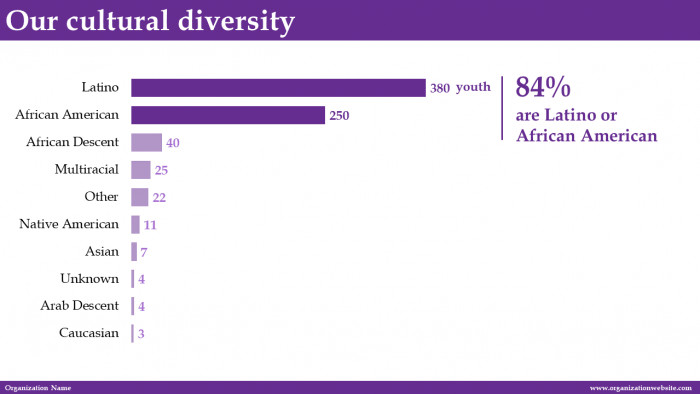
Nowadays, I know better. Here’s how I would revamp that slide if I were to design it today.
- First, I would remove a lot of unnecessary ink. I would delete the logo and the redundant sentences and remove the gray background shading. I would also remove the 3D effect, which was distorting the data—making the columns look taller or smaller than they really were.
- Next, I would more intentionally use text to help tell a story. As an organization, we spent a lot of time serving Latino and African American youth in the surrounding neighborhoods. In the original column chart, the names of the ethnicities were too close together to be legible to staff in the back of the room. I would rotate the vertical column chart into a horizontal bar chart, then reorder the categories so that the Latino and African American youth would be listed first.
- Finally, I would apply strategic branding and design choices. This includes incorporating the organization’s fonts and color palette and using dark colors and an annotation to help key numbers pop.
What a difference!
I apply these techniques to all of my reports, slide decks, dashboards, and infographics—including a series of state profiles I recently partnered with NHVRC on for the Data Supplement to the 2017 Home Visiting Yearbook. Here’s a behind-the-scenes peek at how an early draft received the same three-step treatment.
1. Remove a lot of unnecessary ink. At a bare minimum, we needed to remove unnecessary design elements. In the example below, we removed the graph’s border, generic title, and vertical and horizontal lines. We also adjusted the wording and the colors.
The software program’s default settings (left) and our edited version of the same graph (right)
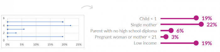
2. Intentionally use text to help tell a story. As data visualization becomes more popular, I often see people focus so much attention on creating good images that they forget about the text. Both can work together to tell your story. Here’s how we translated the bullet points from our spreadsheets into full sentences.

The bullet points from our spreadsheet (left) translated as full sentences (right)
3. Apply strategic branding and design choices. We started with the NHVRC color palette. You might recognize these colors from the NHRVC website. The “before” version of an NHVRC state profile is displayed below on the left. It’s colorful, sure, but the colors are primarily used to decorate the page. In the “after” version (displayed below on the right), we intentionally color-coded items by category. Information about children has turquoise text and graphs, while information about families uses purple text and graphs. We wanted readers to spot the two colors—and therefore distinguish between the two buckets of data—instantly.
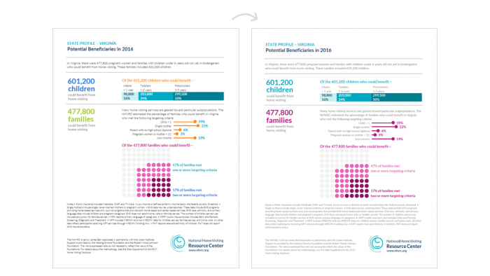
We began with colors from the NHVRC palette, selected one color per category, and used dark color to indicate “more” of each variable.
We also used dark colors intentionally within sections. Do you see the turquoise bar chart depicting age ranges? Light turquoise corresponds to less age (i.e., younger children) while dark turquoise corresponds to more (i.e., older children). We applied darker colors intentionally in the waffle chart at the bottom of the page, too.
In the visual perception world, we call dark color a preattentive attribute. Our brains are wired to notice dark colors without any conscious thought. We can instantly see the difference between dark and light colors without even having to think about it!
These three steps can go a long way helping translate your data into compelling “data viz.” Visit the Data Supplement’s state profiles section to see these principles in action.