
Ann Emery provides data visualization expertise to the National Home Visiting Resource Center (NHVRC). Earlier this year, she wrote a guest blog on making good graphs great.
It’s intimidating to sit in front of a blank screen and try to start developing your report, infographic, or dashboard from scratch. What data sources will you include? How will you analyze the data? What type of graph will best present your results?
The NHVRC provides hundreds of pages of data about home visiting across the United States. Our team works together behind the scenes to create and finesse each visualization. We want to make sure the numbers are accurate, easy to understand, and visually appealing.
As we tweak the design elements of the 2018 Home Visiting Yearbook—the NHVRC’s third major publication since launching in 2017—we’ve revisited some of our earliest conversations around data visualization. This brief presents our process in five simple steps, along with images of products at various phases. We hope this inside look can help guide readers looking to share their own home visiting data.
Step 1. Select Your Data Sources
Will you use publicly available datasets? Will you need to collect new data? Which specific variables are available? Sit down with your teammates and select data sources together, just like the NHVRC did during one of our earliest brainstorming sessions. Your process doesn’t have to be fancy. Handwritten notes and whiteboards work just fine.
Step 2. Choose Your Unit of Analysis
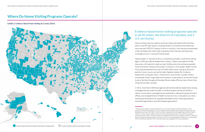
Next, think about how you’ll analyze your numbers. For the NHVRC, we decided to provide both national- and state-level analysis of the numbers. The 2017 Home Visiting Yearbook and follow-up Data Supplement present a map of the United States, so that readers can see where home visiting programs operate across the country. Later, we provide individual state profiles, so that readers can learn about the children and families who benefit from home visiting in particular states and territories. We also decided to provide model-level details in a series of model profiles.
Step 3. Brainstorm Your Page Layout
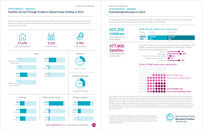
It’s one thing to design a single graph. It’s another to design an entire page or report! The graphs need a logical, intentional flow from one to the next. Start broad and then go deeper. For the NHVRC State Profiles, we started with the broadest details, like the name of each state and the number of children reached by home visiting programs. Then we dove into demographic details about those children and their caregivers.
Step 4. Choose the Right Chart for Each Variable
Will you use a pie chart, a bar chart, or something else altogether? Here are a few familiar chart types and some that you may not have encountered before.
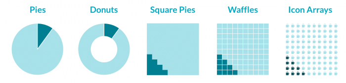
Pies and Donuts
Let’s start with the most familiar chart of all, the pie chart. Some data visualization trainers advise against using pie charts at all. That’s probably because so many of us accidentally include too many slices, like this impossible-to-read pie. Here’s what not to do.

Two-slice pies are fine. You can also try an alternative, like a two-slice donut, two-slice waffle, or two-slice icon array. Icon arrays contain miniature shapes, like the miniature coffee cups below.
Bar Charts
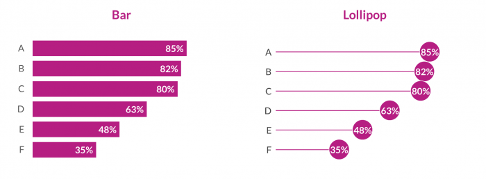
Bar charts are another familiar chart type. My advice—if you’re not sure which chart to use, start with a bar chart instead of a pie chart. Bars are often easier to read than pies, especially when you’ve got more than two categories.
The only problem with bar charts is that they tend to be overused. Try an alternative, like a lollipop chart, which places a dot at the end of the bar. Lollipops tend to look cleaner than bars, and they focus viewers’ attention where you want it—on the endpoints.
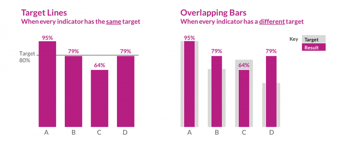
If you decide to continue using bar charts, consider adding valuable context. Does your organization track your progress toward meeting year-end goals or specific outcomes outlined in grants or contracts? If so, add a target line or use overlapping bars to showcase your achievements.
Line Charts
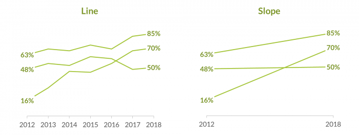
Need to show how something has unfolded over time? Try a line chart to let your viewers see all the peaks and valleys. Want to focus on the big picture? Try a slope chart, in which viewers focus on the steepness of the slope over time.
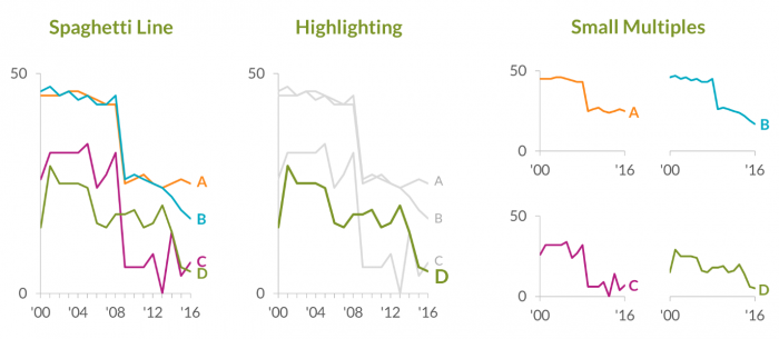
When you’re using line charts, beware of the spaghetti line! Spaghetti lines crisscross and intersect—just like a pile of tangled spaghetti—making them near-impossible to decipher. If you see a spaghetti line chart in your project, don’t worry. You can try making it easier to read by highlighting a single line of interest in a darker color or testing a small multiples layout in which you build multiple small charts, one per line.
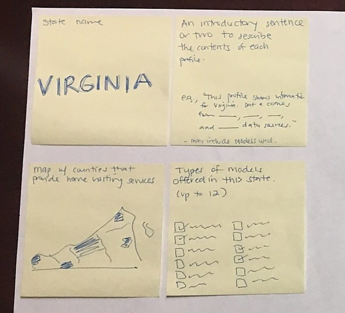
Step 5. Draft Your Visualizations With Sticky Notes
You may be tempted to sit down at your computer and begin creating charts right away. I’ve found it helpful to create drafts with good old paper and pencil before creating anything on the computer. I also like using sticky notes as I’m drafting because they allow me to move graphs around the page and get the placement just right. Your sticky notes might contain some of the pies charts, bar charts, or line charts shown previously.
While drafting the NHVRC State Profiles, we drew one graph covering one variable per sticky note. Then, we arranged and rearranged the sticky notes. As a team, we talked about which variables should come first, second, and third on each page. When we reached consensus, we started building the graphs on the computer. Drafting on paper saved us a lot of time and helped us develop a final product that reflected everyone’s input.
We hope this behind-the-scenes peek into our data visualization process and early images can help you during your own drafting process. Click through the NHVRC website to see our results so far and feel free to send us your data masterpieces!